REMON x MOJOC
PROJECT DETAILS
Location: 成都市镋钯街88号
Chief Designer & Team: Mojo Wang Dr.Hoo 邱天
Graphic Designer:鲍BAO
CAD Designer: 王欢
Photography: 邱天 MAGI
Area: 621㎡
Year: 2019
INTRODUCTION | 项目介绍
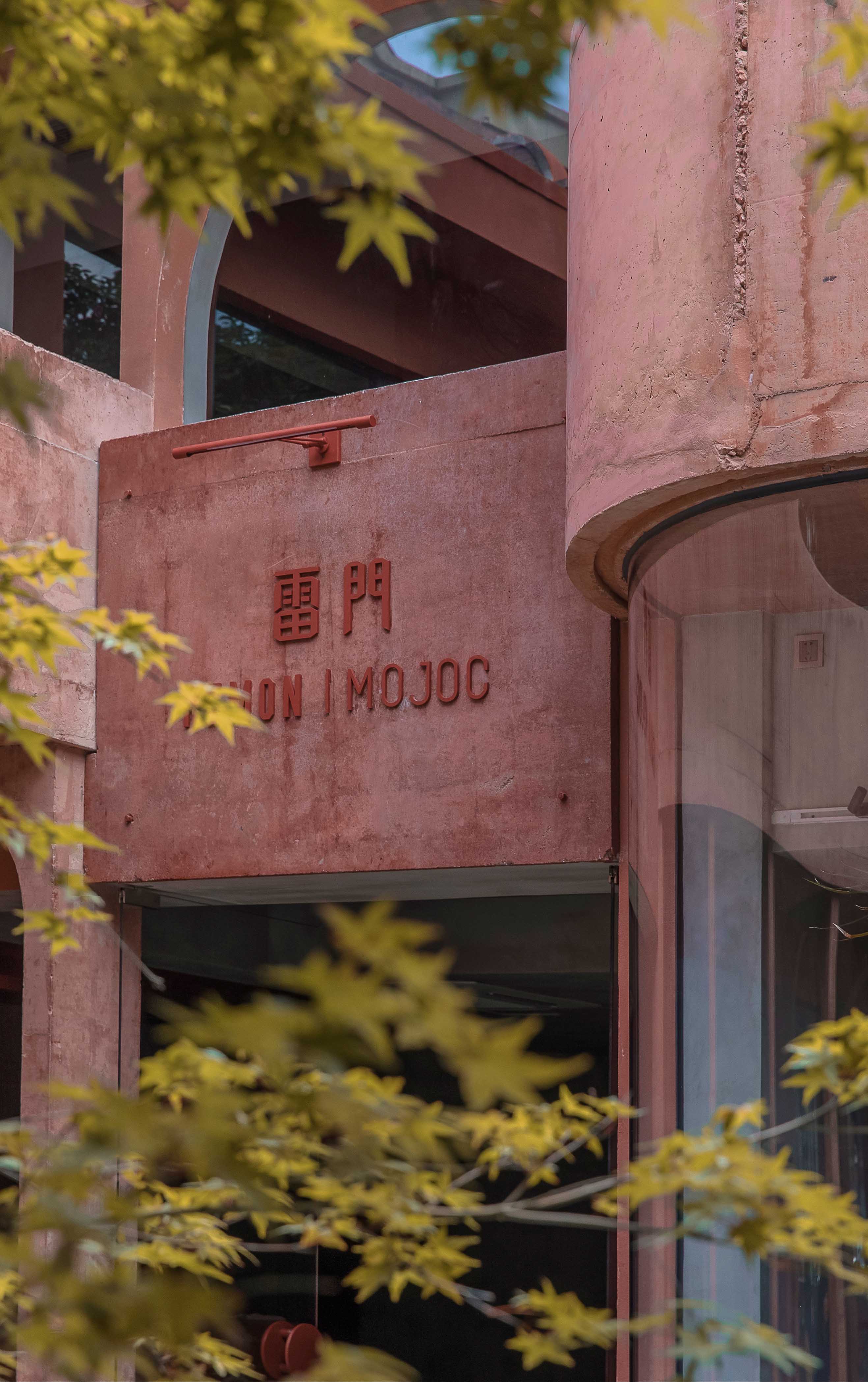
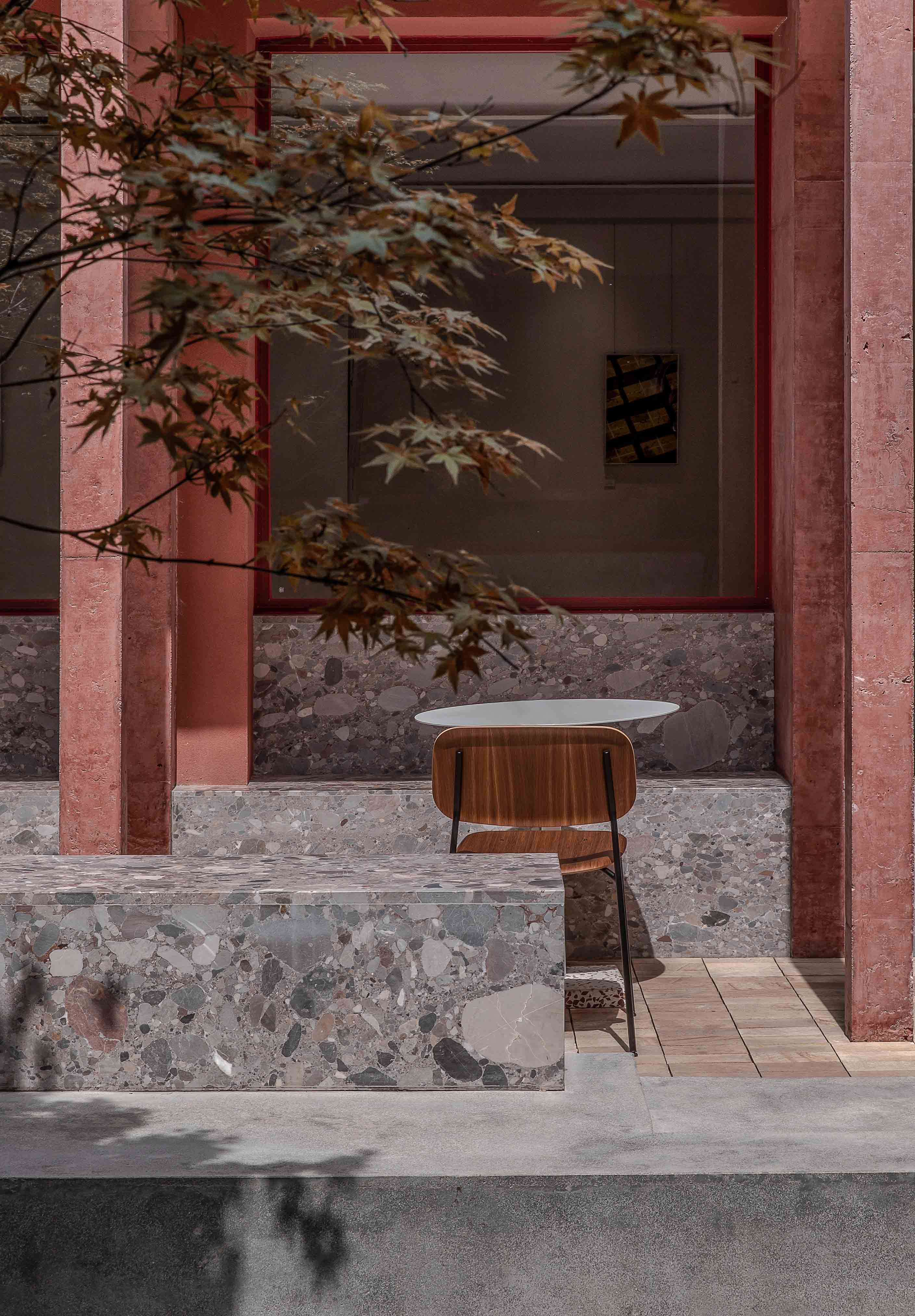
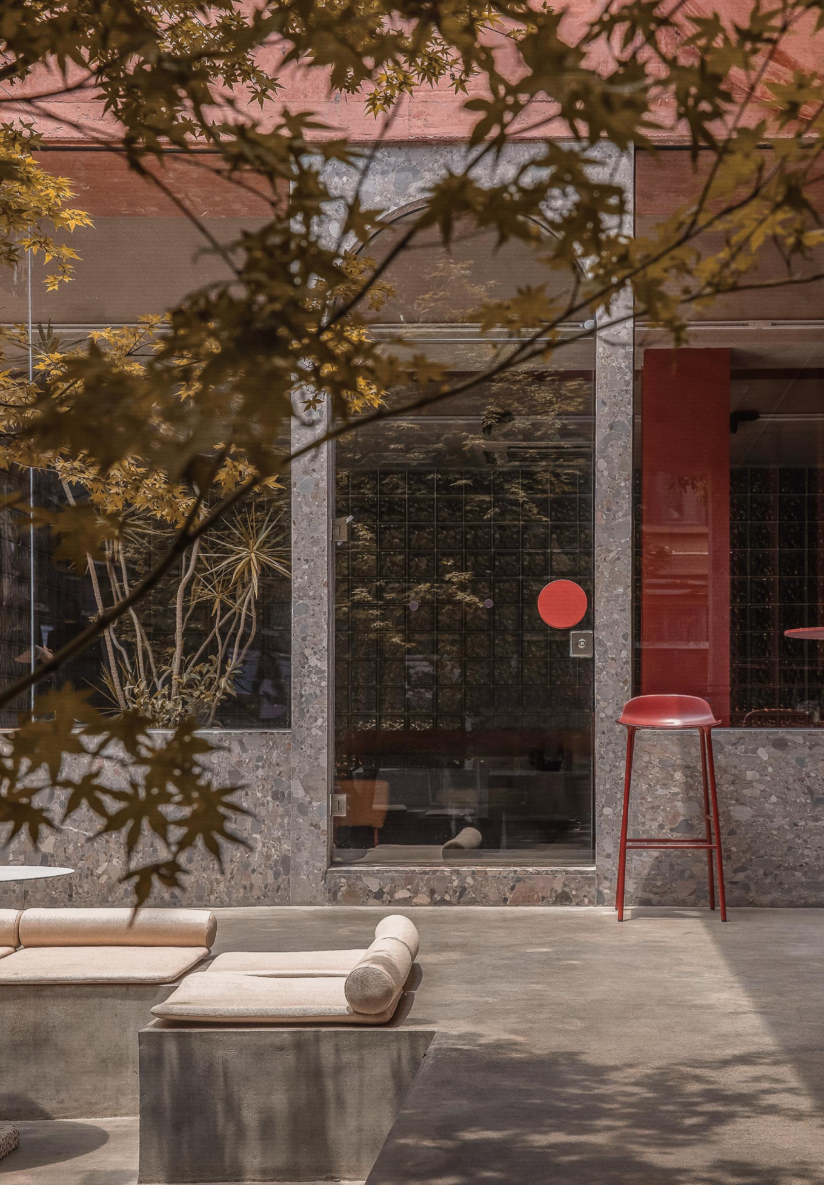
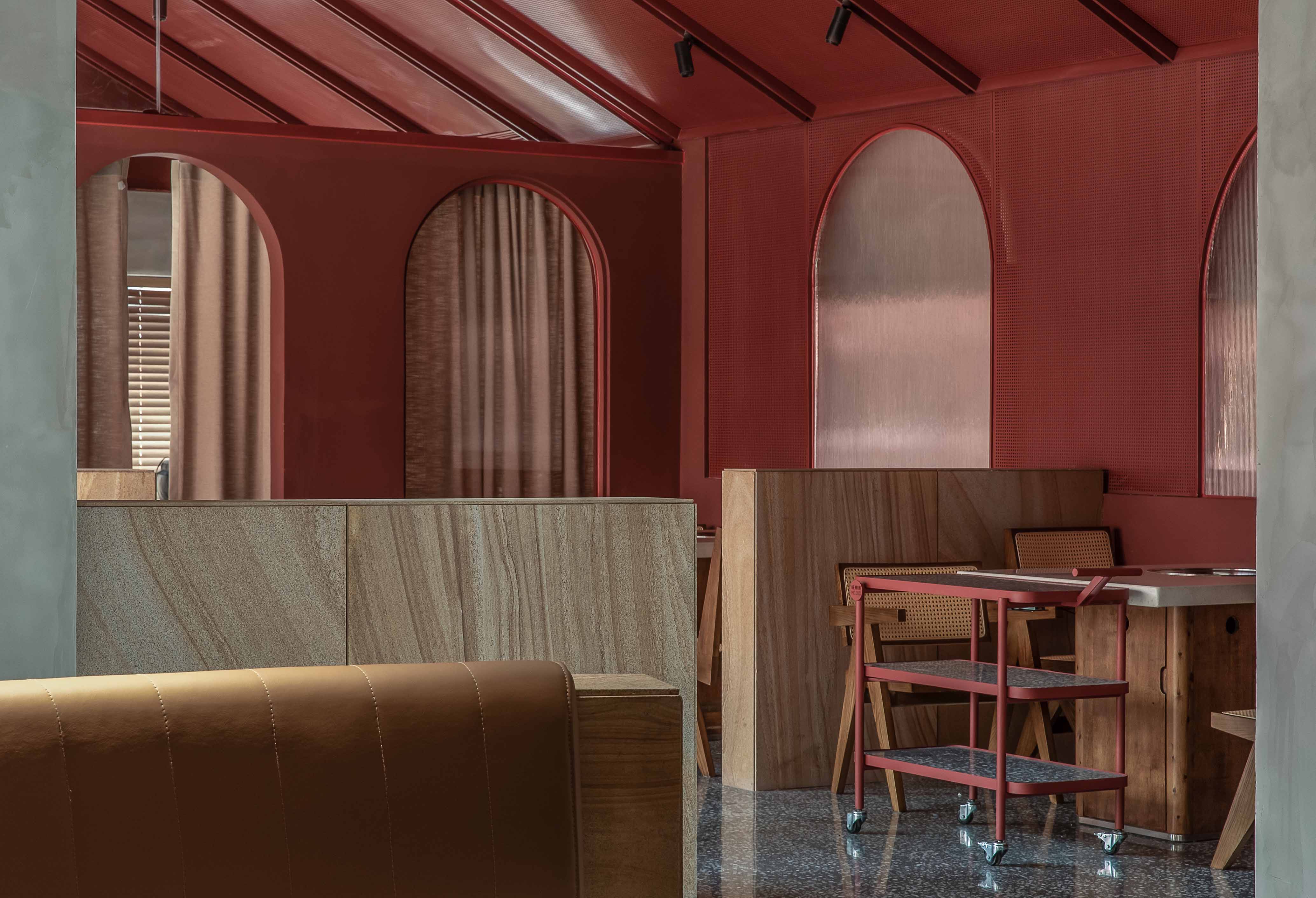
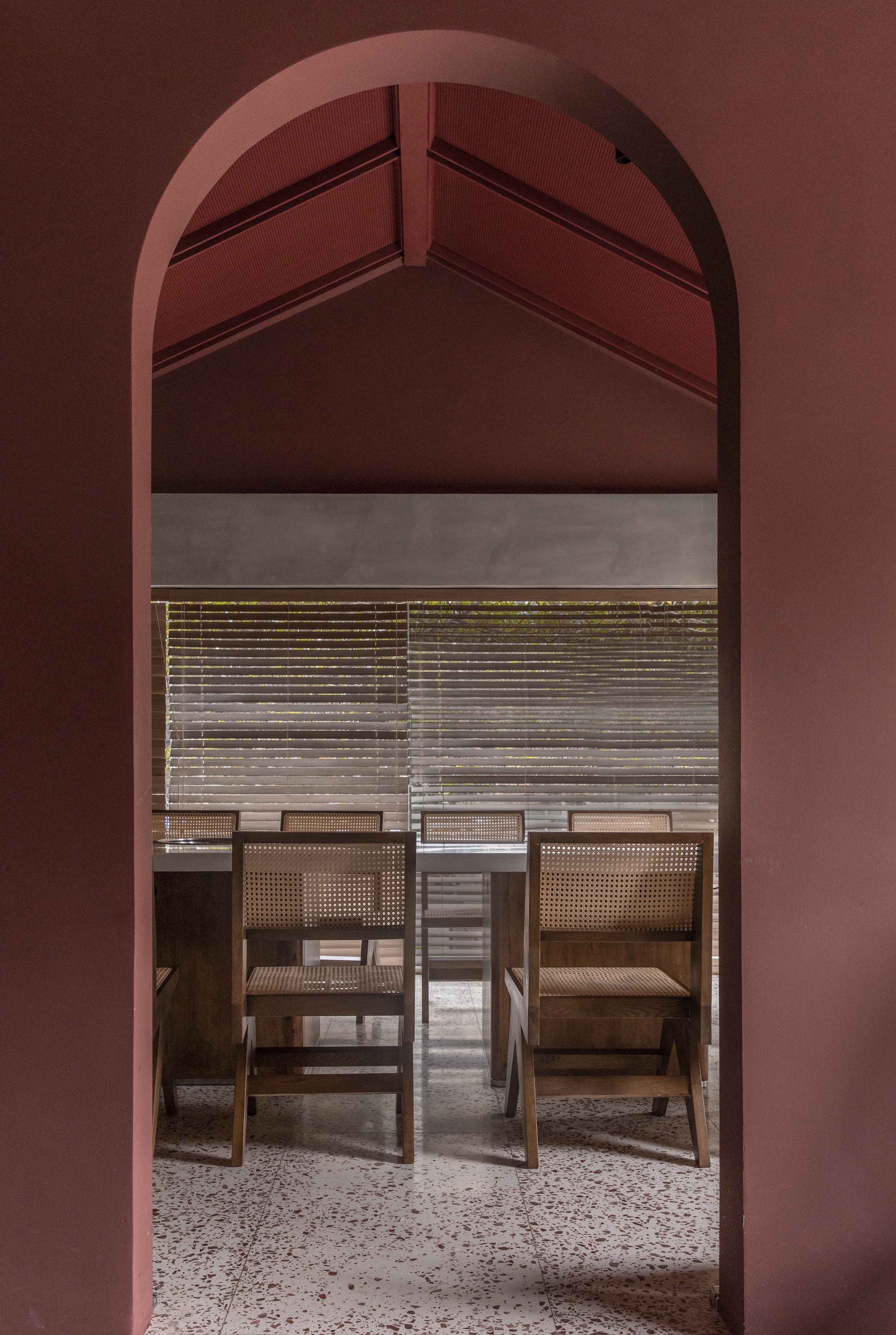
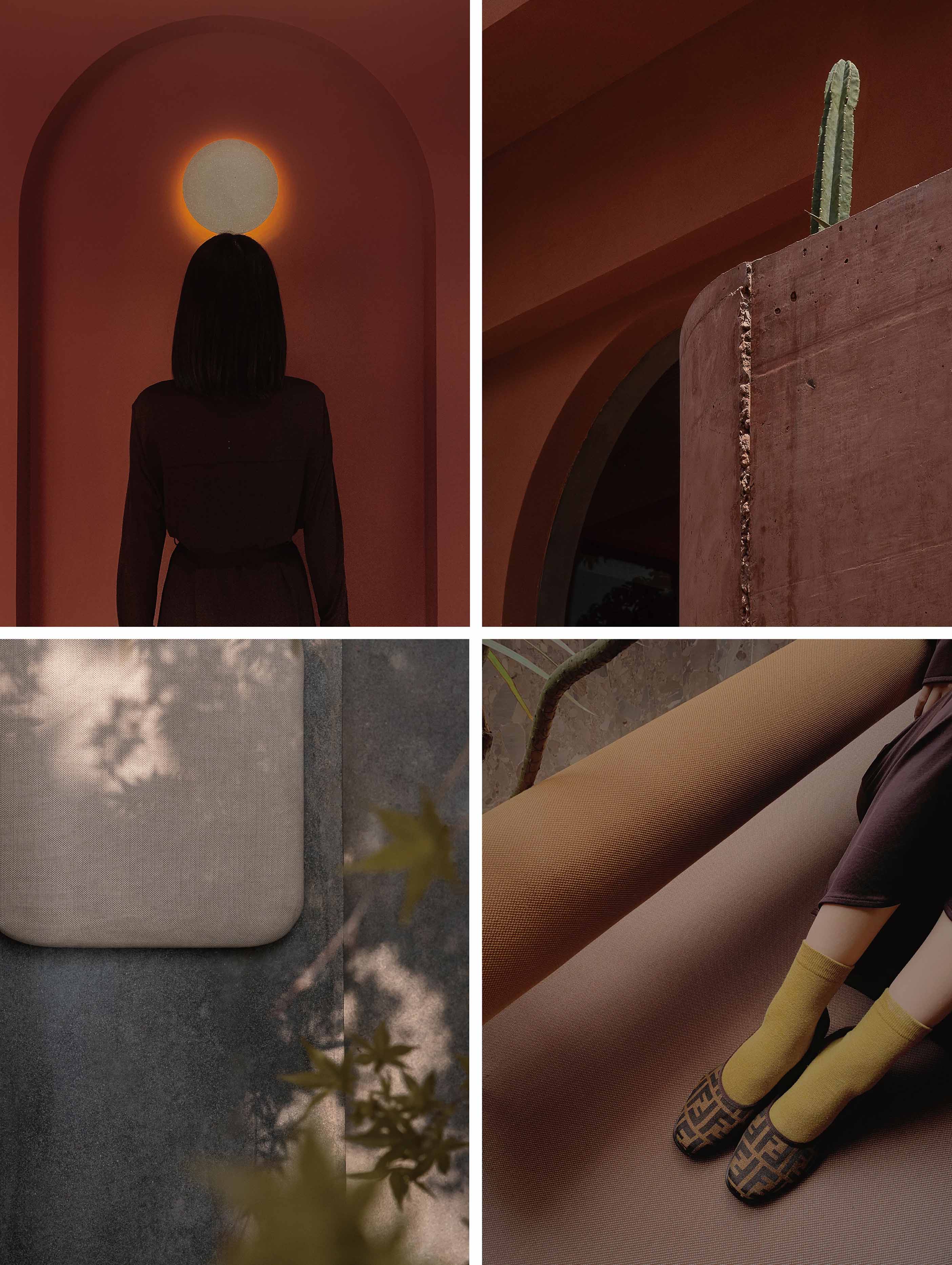
REMON x MOJOC 是一个集咖啡\ 展览\ 餐饮于一体的综合空间。坐落于新建筑与老建筑融合在一起的综合区域-镋钯街。门店选址既考虑到市中心的地理位置本身所具有的集中属性,也希望为传统的社区增添新鲜活力,丰富街道公共区域的休闲体验,使前卫文化与经典文化融而成一体。如何运用视觉符号让多业态融合统一,打破行业的固有思维概念,是极具挑战性的尝试。设计团队选用红色的几何建筑结构打破了原有建筑的界限,营造了多个灰空间,模糊室内外区域界限。四季分明的植物、有色混凝土与天然石材的运用也将整个空间打造成极具设计感的艺术品。
REMON x MOJOC is a multi-functional space including cafe, exhibition and restaurants. It located at Tang Pa street, an area where traditional and modern constructions intertwined. The location of the store not only takes into account the city center’s concentration nature, but also hopes to add fresh vitality to the traditional community, enrich the entertainment of the public areas, and integrate avant-garde culture with the traditional culture. It is a challenging attempt to use visual symbols to integrate multiple formats and break the inherent concept in the interior design industry. The red geometric building structure breaks the boundaries of the original building, creates a number of gray spaces, and blends the indoor and outdoor spaces. The use of seasonal plants, coloured concrete and natural stone also makes the whole space into a highly design-oriented work of art.
AREA INTRODUCTION | 区域介绍
REMON x MOJOC 是一个集咖啡\ 展览\ 餐饮于一体的综合空间。坐落于新建筑与老建筑融合在一起的综合区域-镋钯街。门店选址既考虑到市中心的地理位置本身所具有的集中属性,也希望为传统的社区增添新鲜活力,丰富街道公共区域的休闲体验,使前卫文化与经典文化融而成一体。如何运用视觉符号让多业态融合统一,打破行业的固有思维概念,是极具挑战性的尝试。设计团队选用红色的几何建筑结构打破了原有建筑的界限,营造了多个灰空间,模糊室内外区域界限。四季分明的植物、有色混凝土与天然石材的运用也将整个空间打造成极具设计感的艺术品。
REMON x MOJOC is a multi-functional space including cafe, exhibition and restaurants. It located at Tang Pa street, an area where traditional and modern constructions intertwined. The location of the store not only takes into account the city center’s concentration nature, but also hopes to add fresh vitality to the traditional community, enrich the entertainment of the public areas, and integrate avant-garde culture with the traditional culture. It is a challenging attempt to use visual symbols to integrate multiple formats and break the inherent concept in the interior design industry. The red geometric building structure breaks the boundaries of the original building, creates a number of gray spaces, and blends the indoor and outdoor spaces. The use of seasonal plants, coloured concrete and natural stone also makes the whole space into a highly design-oriented work of art.
STRUCTURE INTRODUCTION | 结构介绍
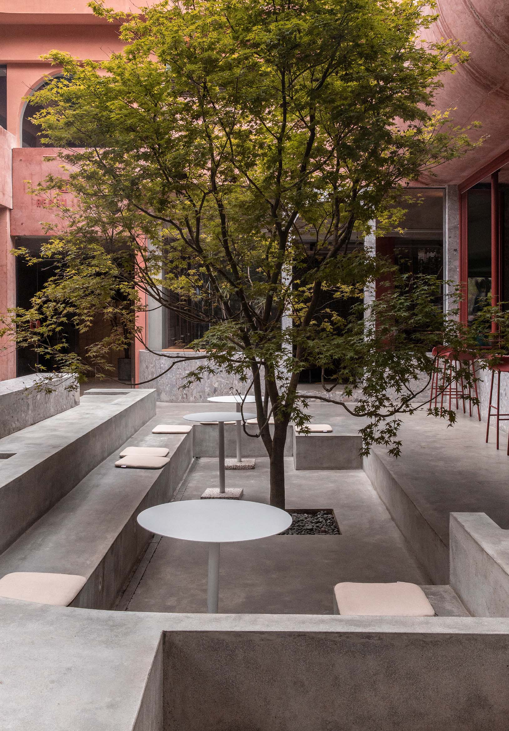
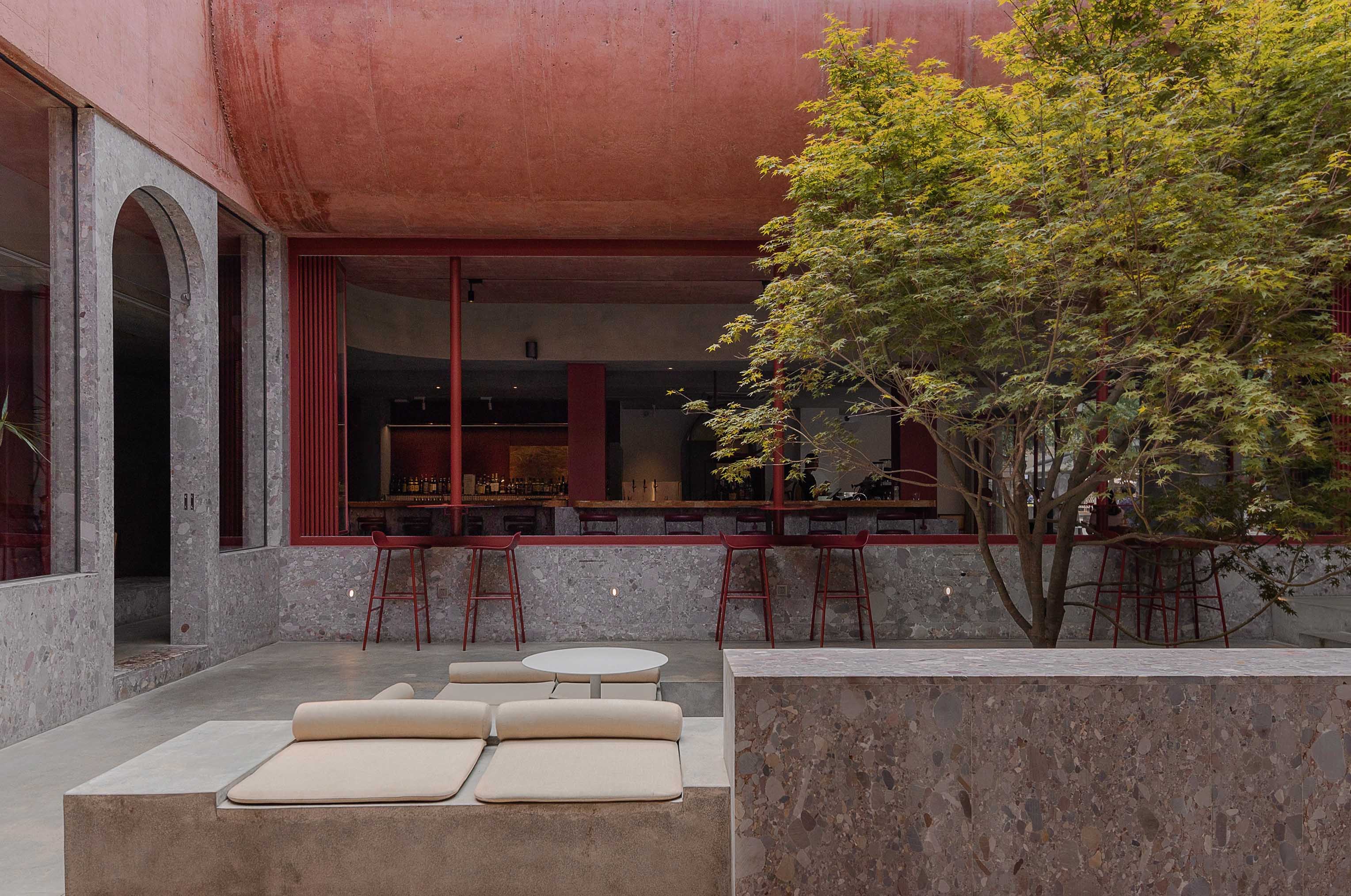
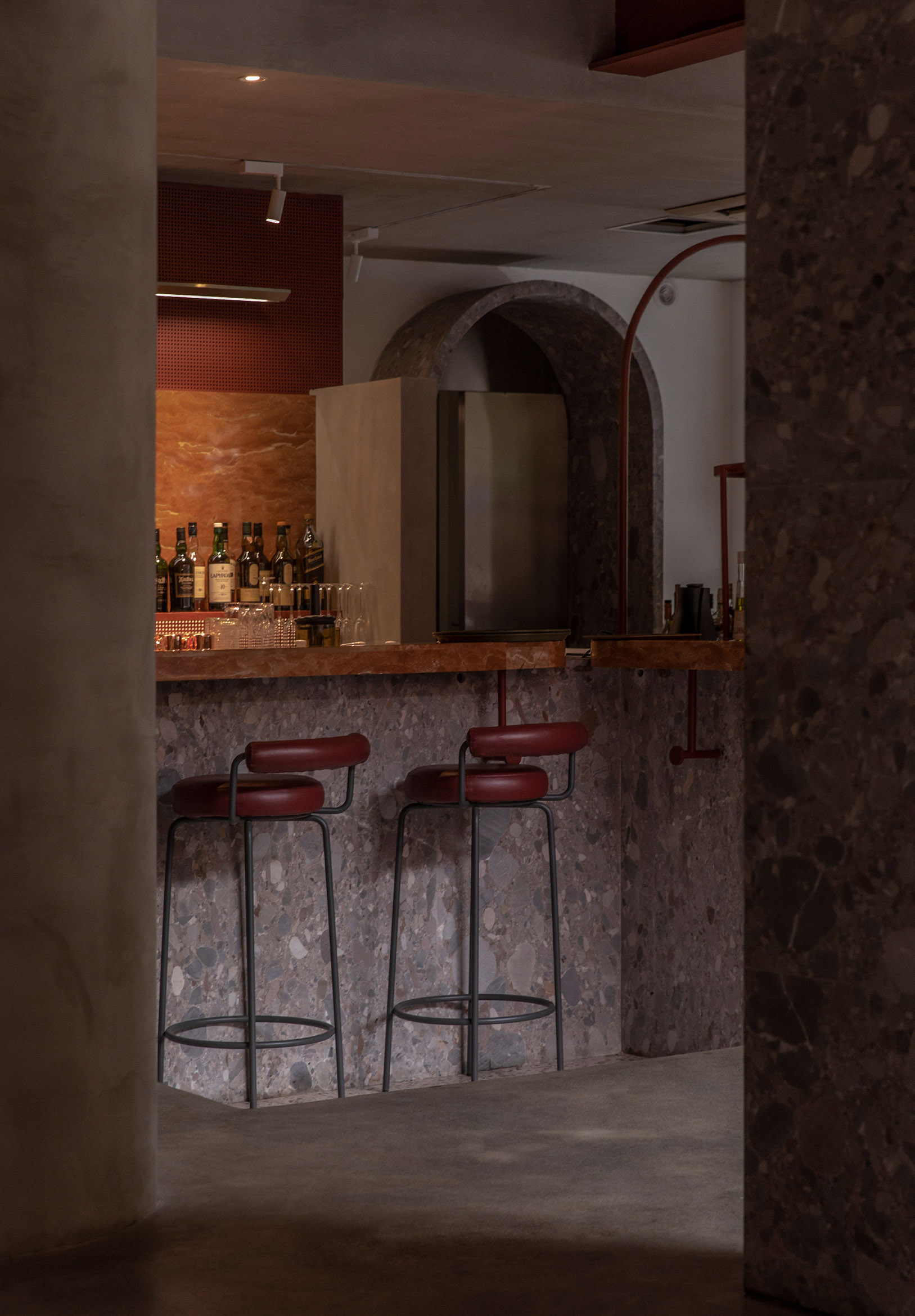
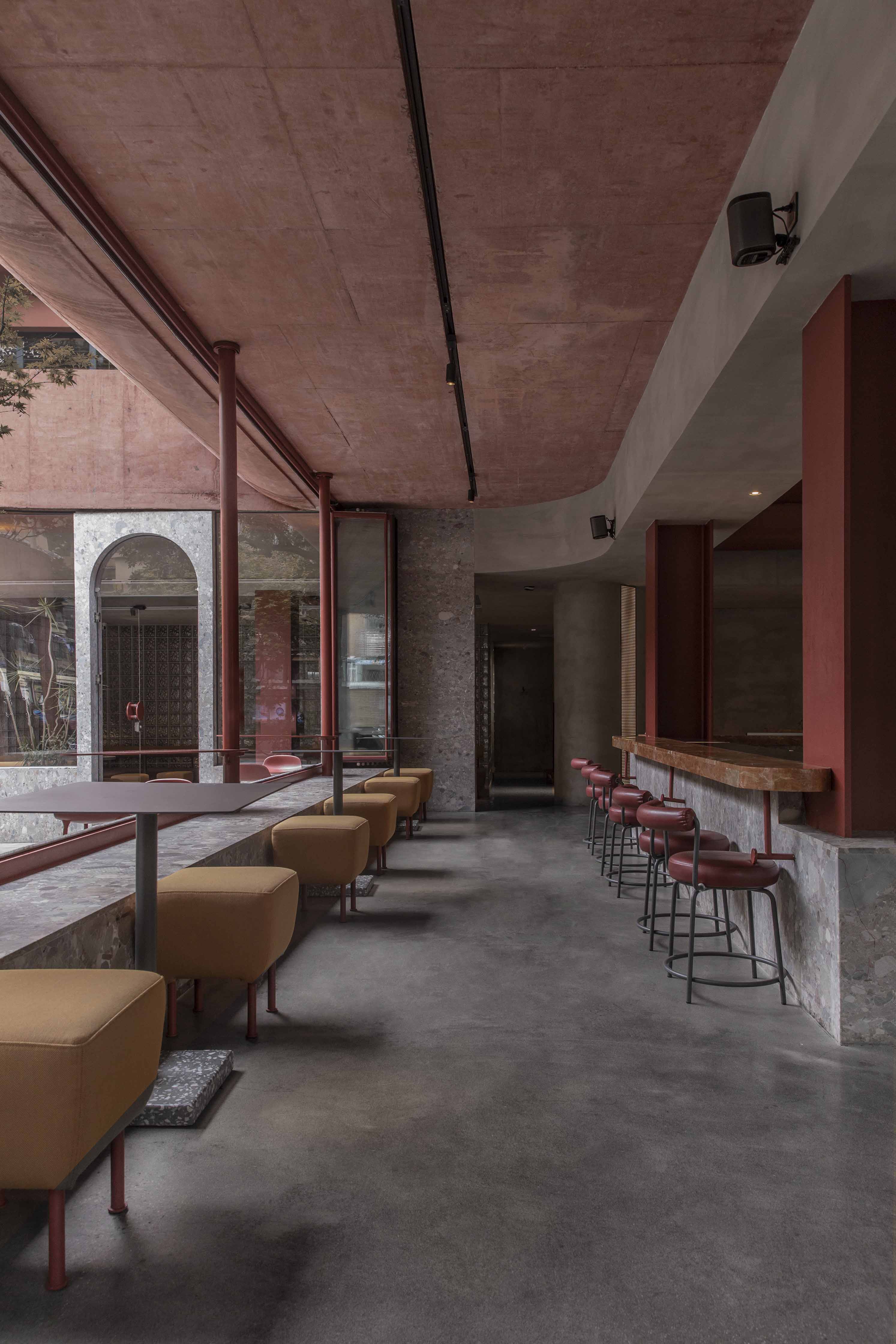
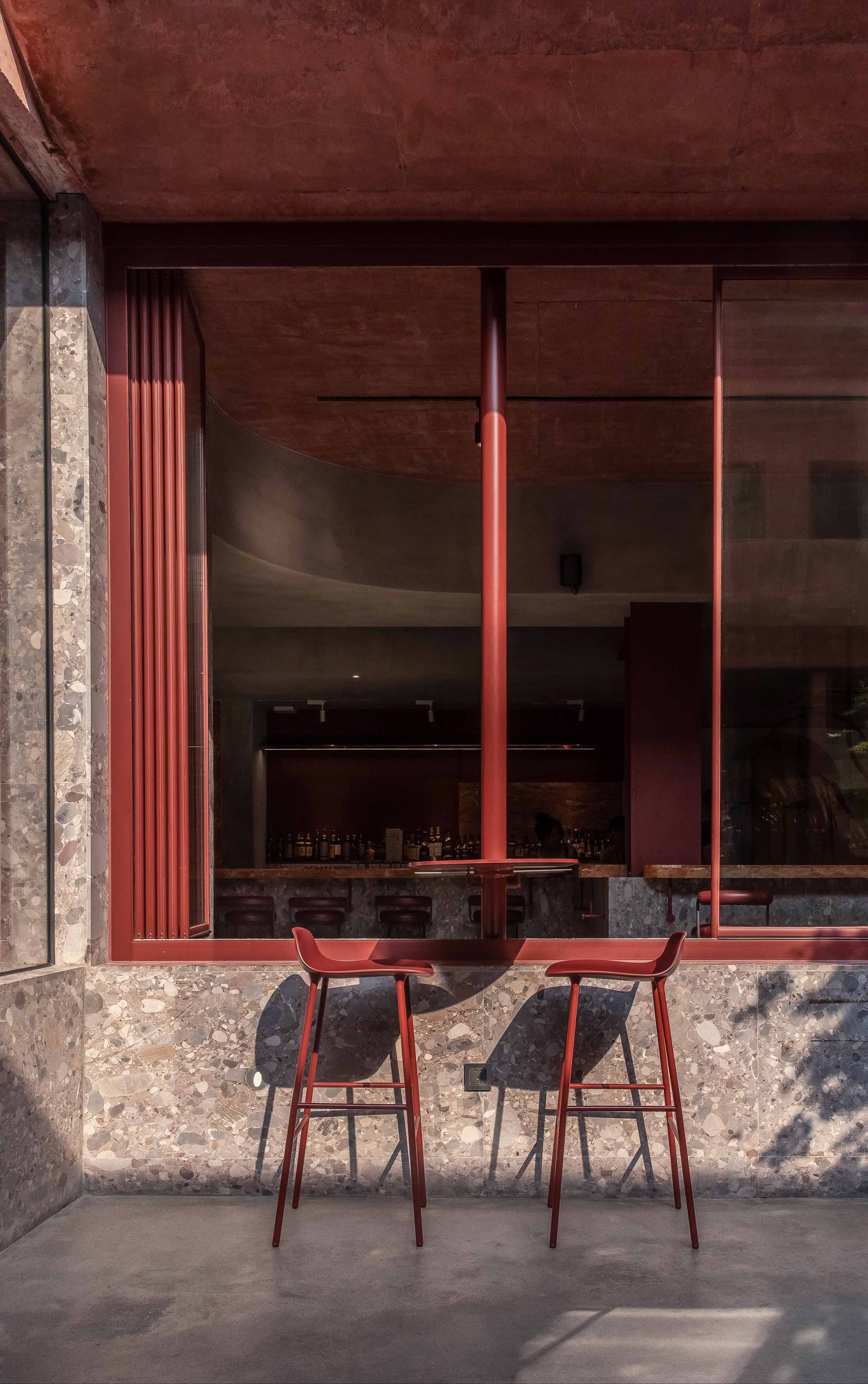
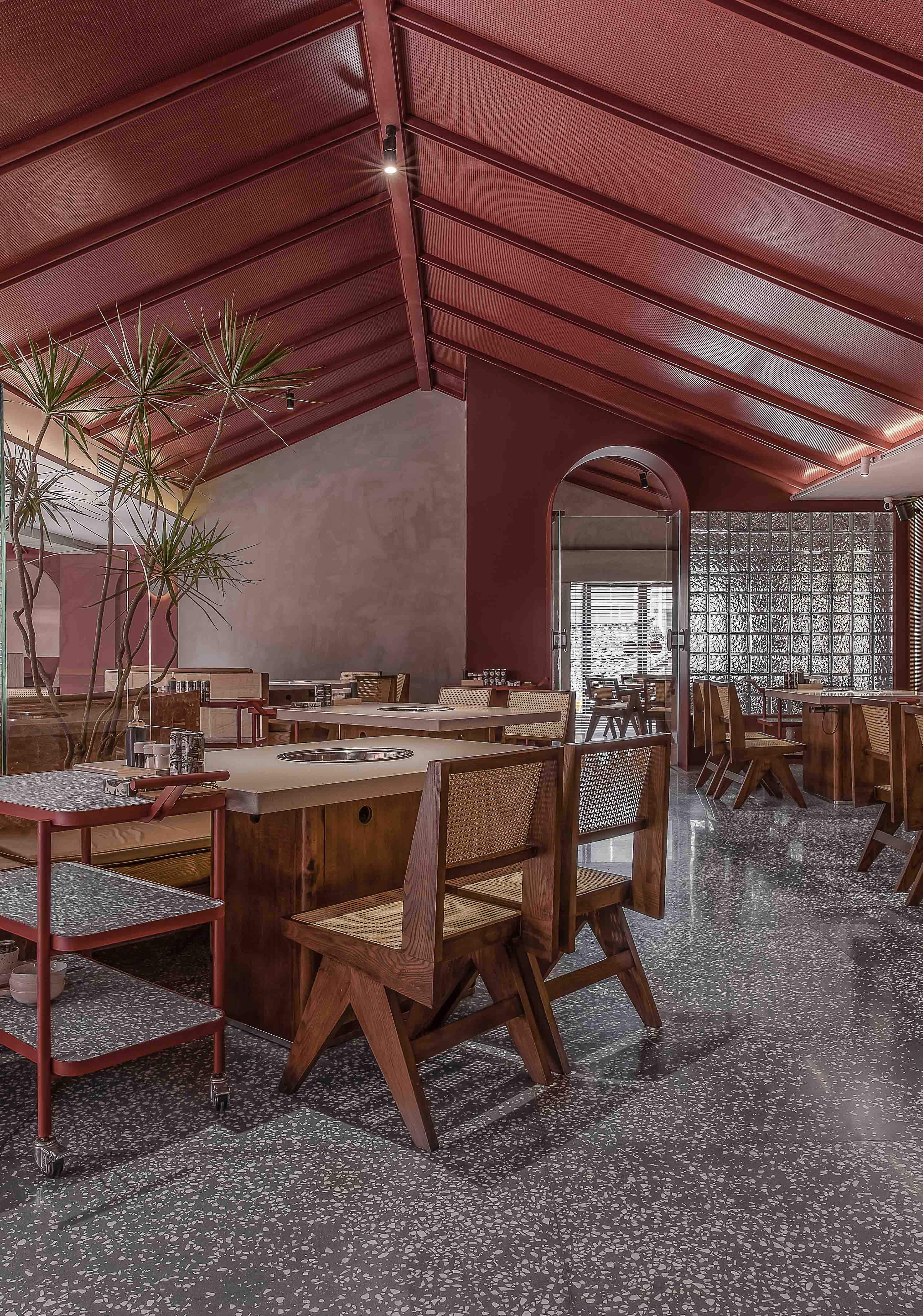
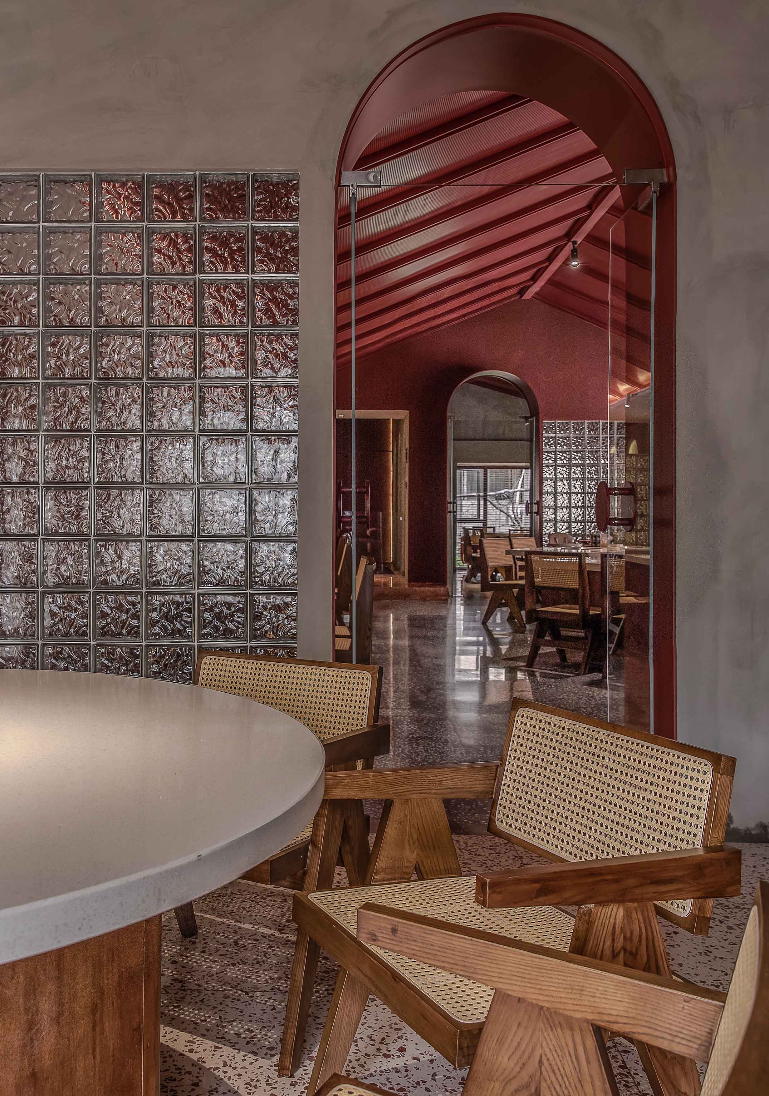
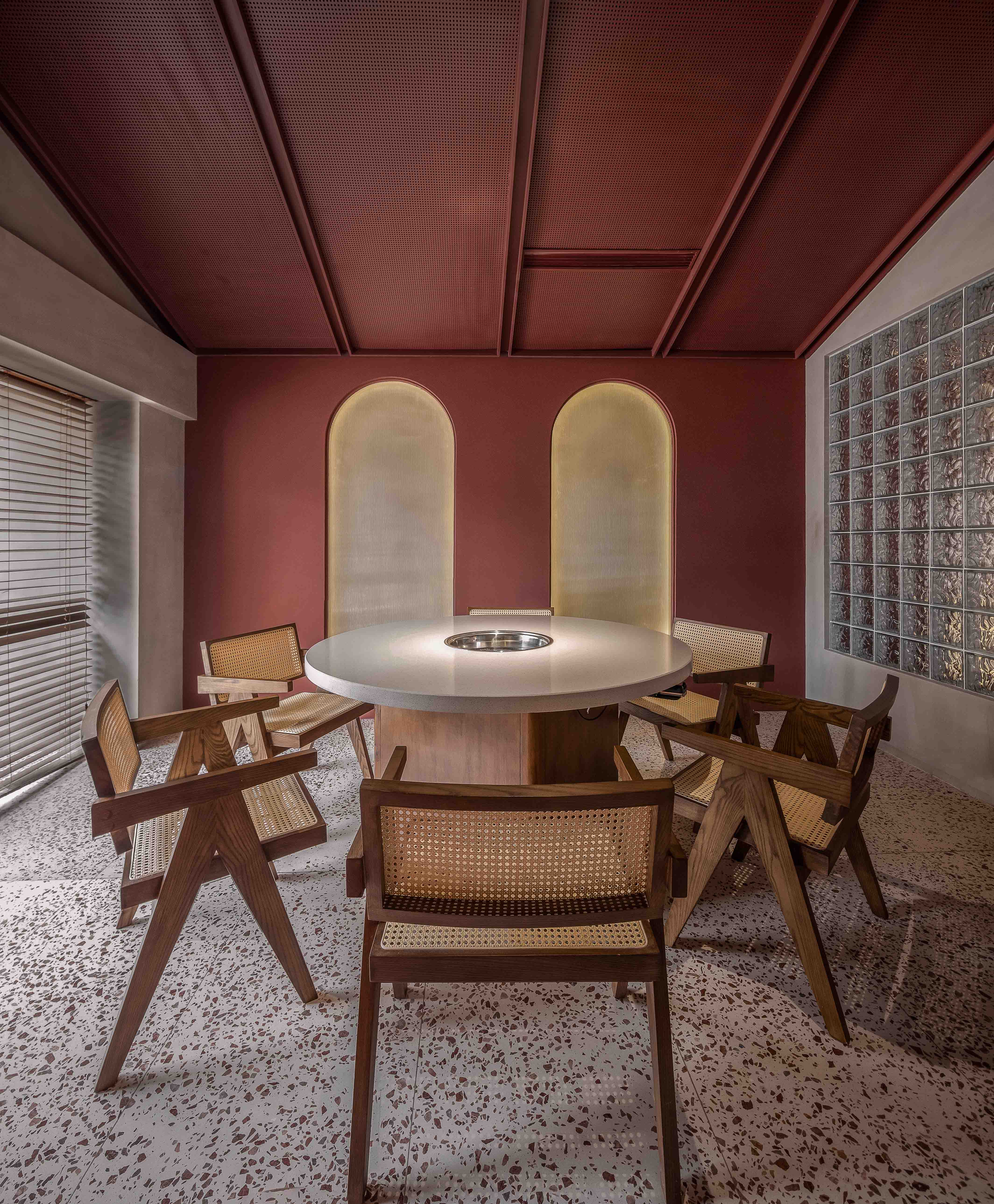
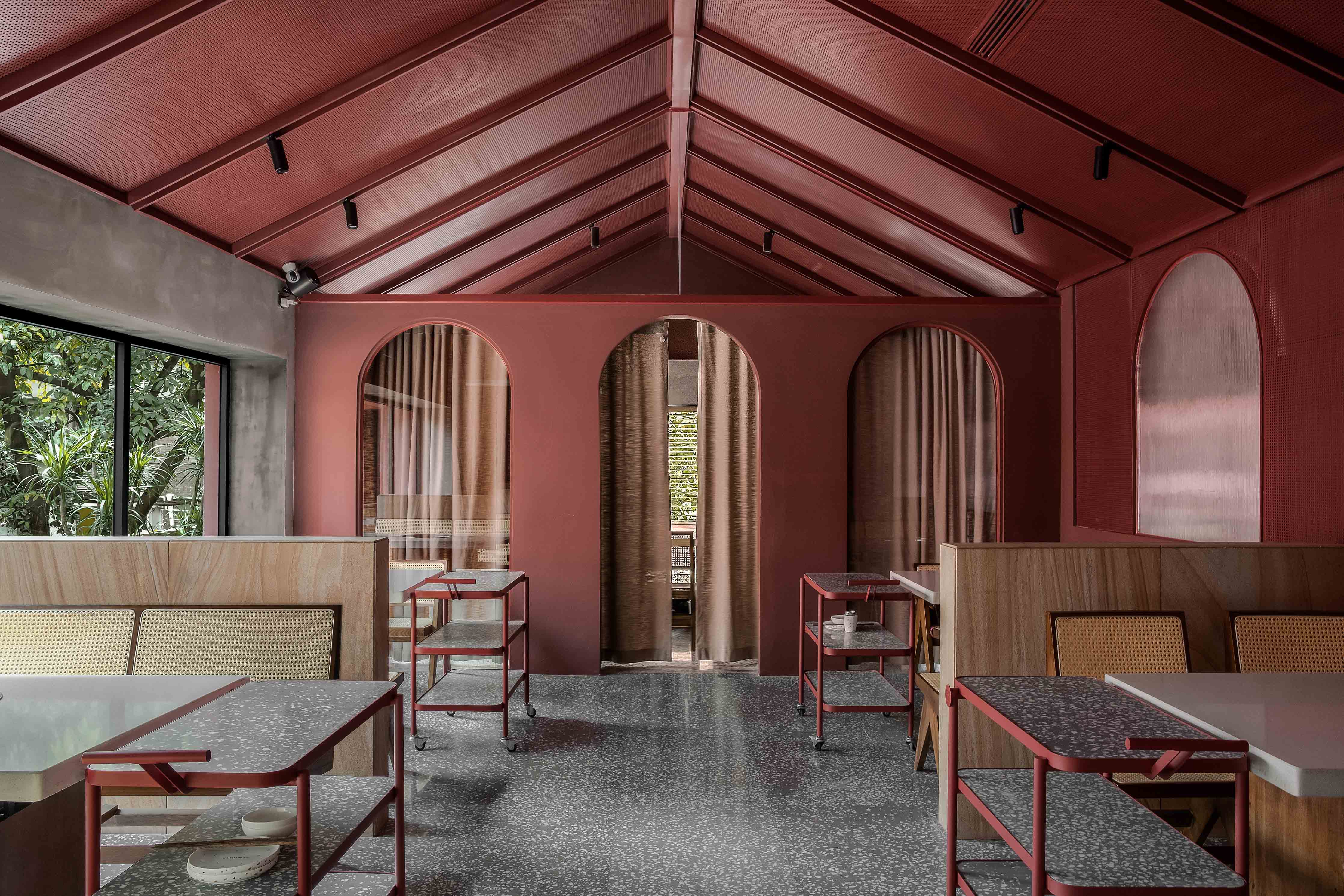
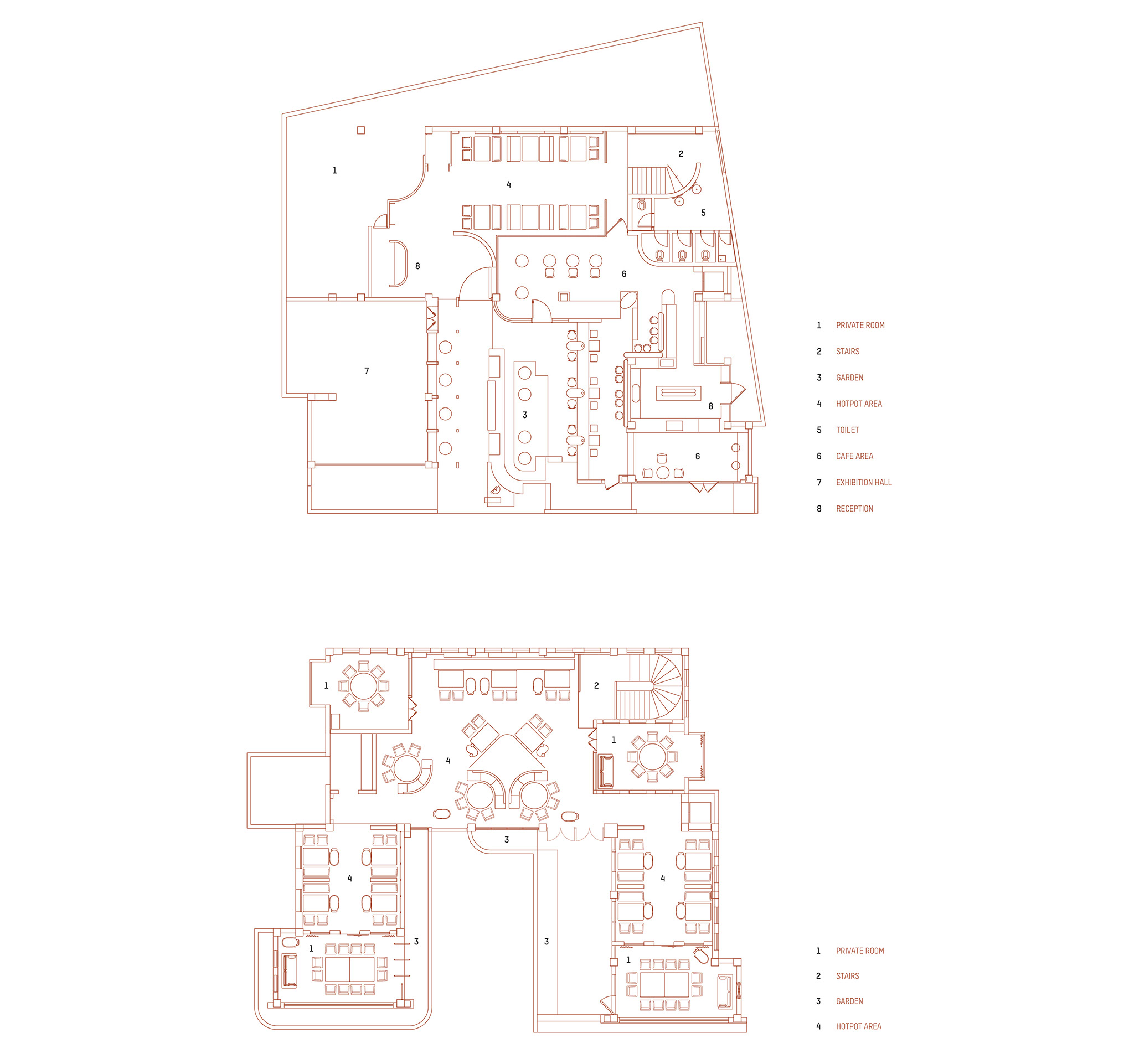
一层室内和庭院分别是咖啡厅与展厅,白天咖啡厅以环境为基础打造了一系列创新下午茶品项,晚间这里又会变成一个适合朋友小聚的酒吧。展厅周期性更新主题展览, 门店二层是雷门火锅的餐饮区域。整个空间将艺术与生活恰当融合,意在打造多元化的休闲体验。
On the first floor, the interior space serves as an exhibition hall. The courtyard is the café and afternoon tea space. During the day, the cafe provides a series of innovative afternoon tea items inspired by the environment. In the evening, the cafe becomes a lounge bar suitable for friends’ gathering. The exhibition hall periodically updates theme exhibitions. The second floor of the store is the catering area of REMON Hotpot. The whole space combines art and life properly, aiming to create a diversified leisure experience.
PLAN | 平面图
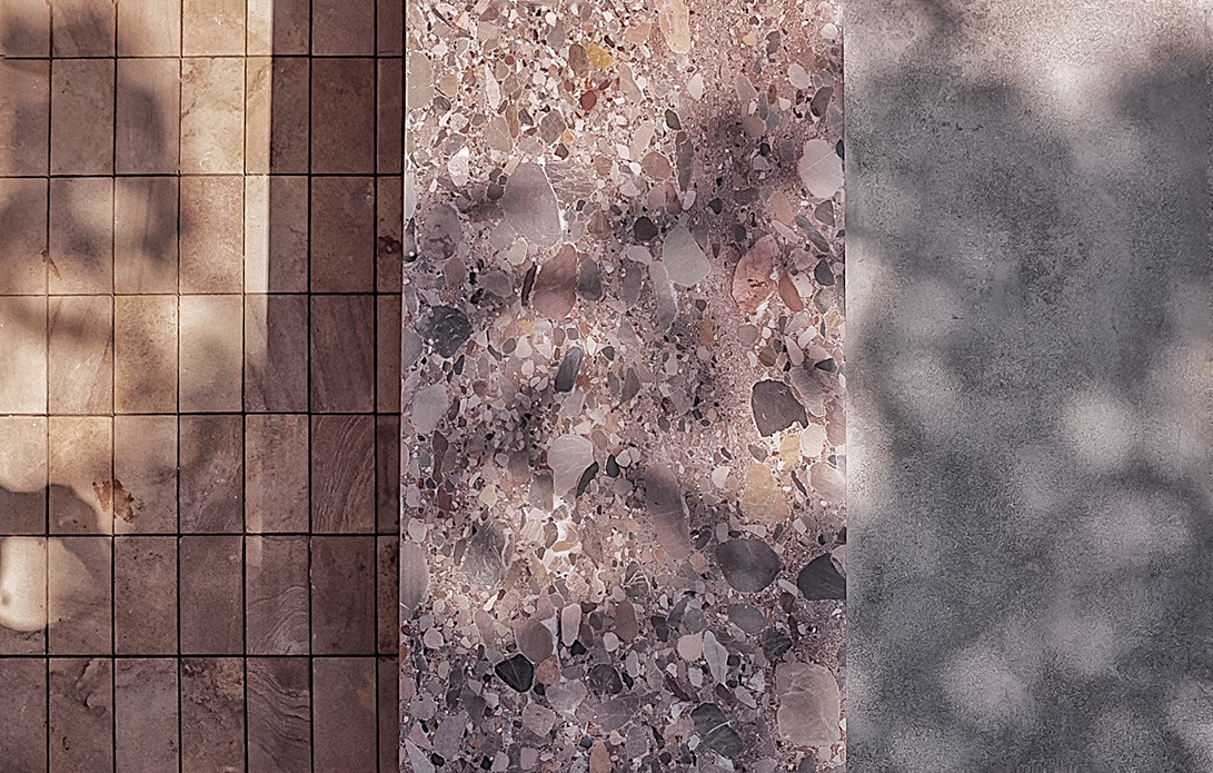
MATERIAL INTRODUCTION | 材料介绍
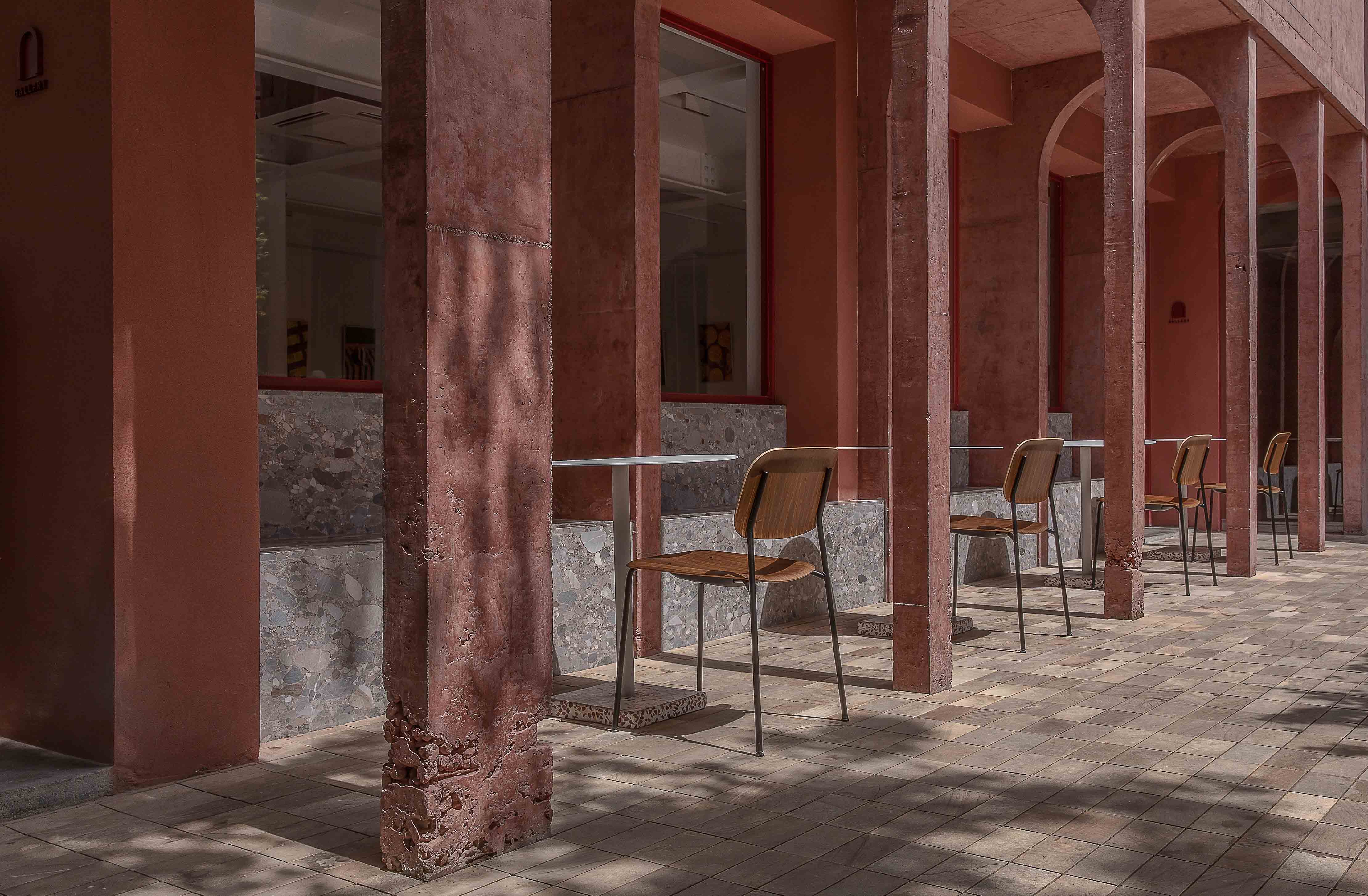
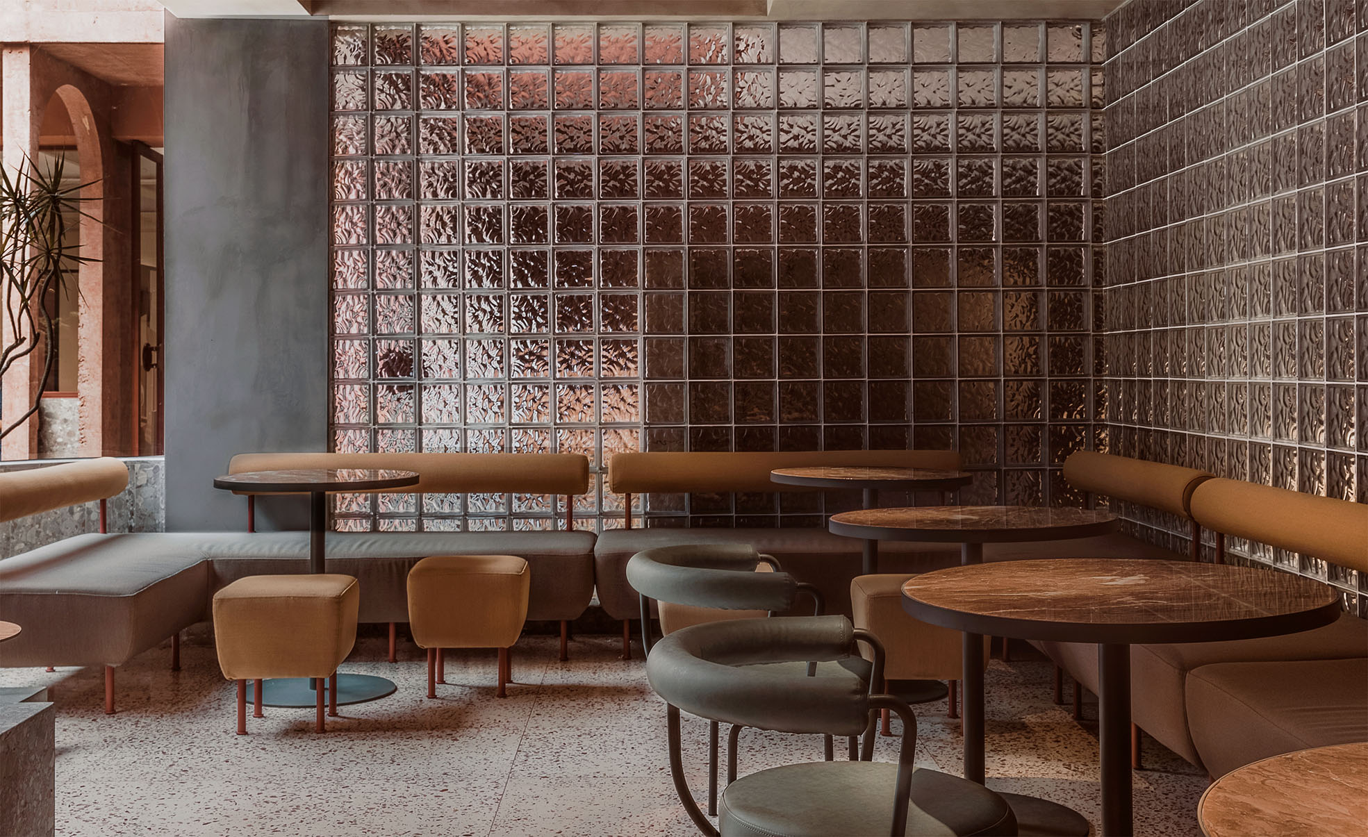
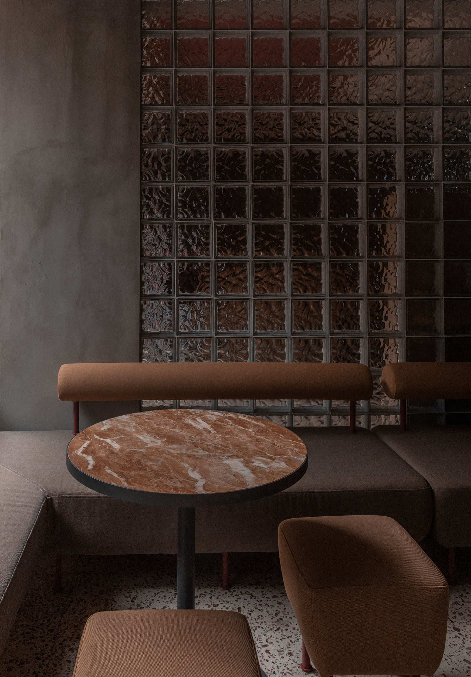
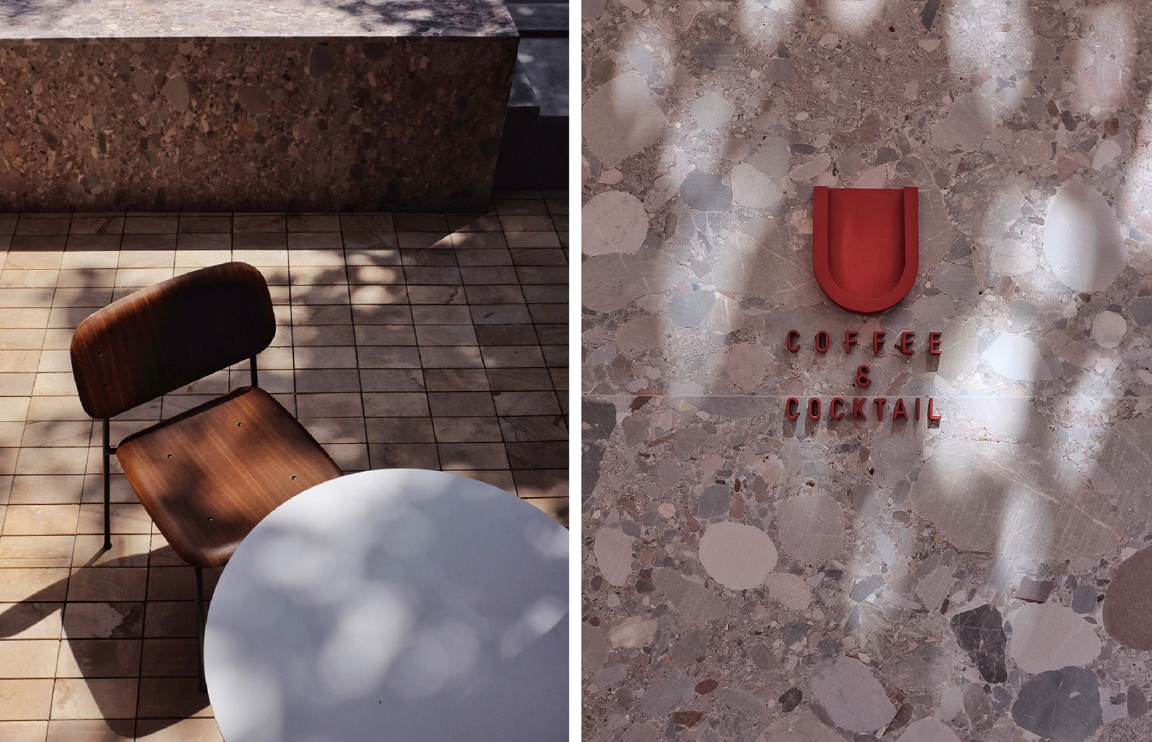
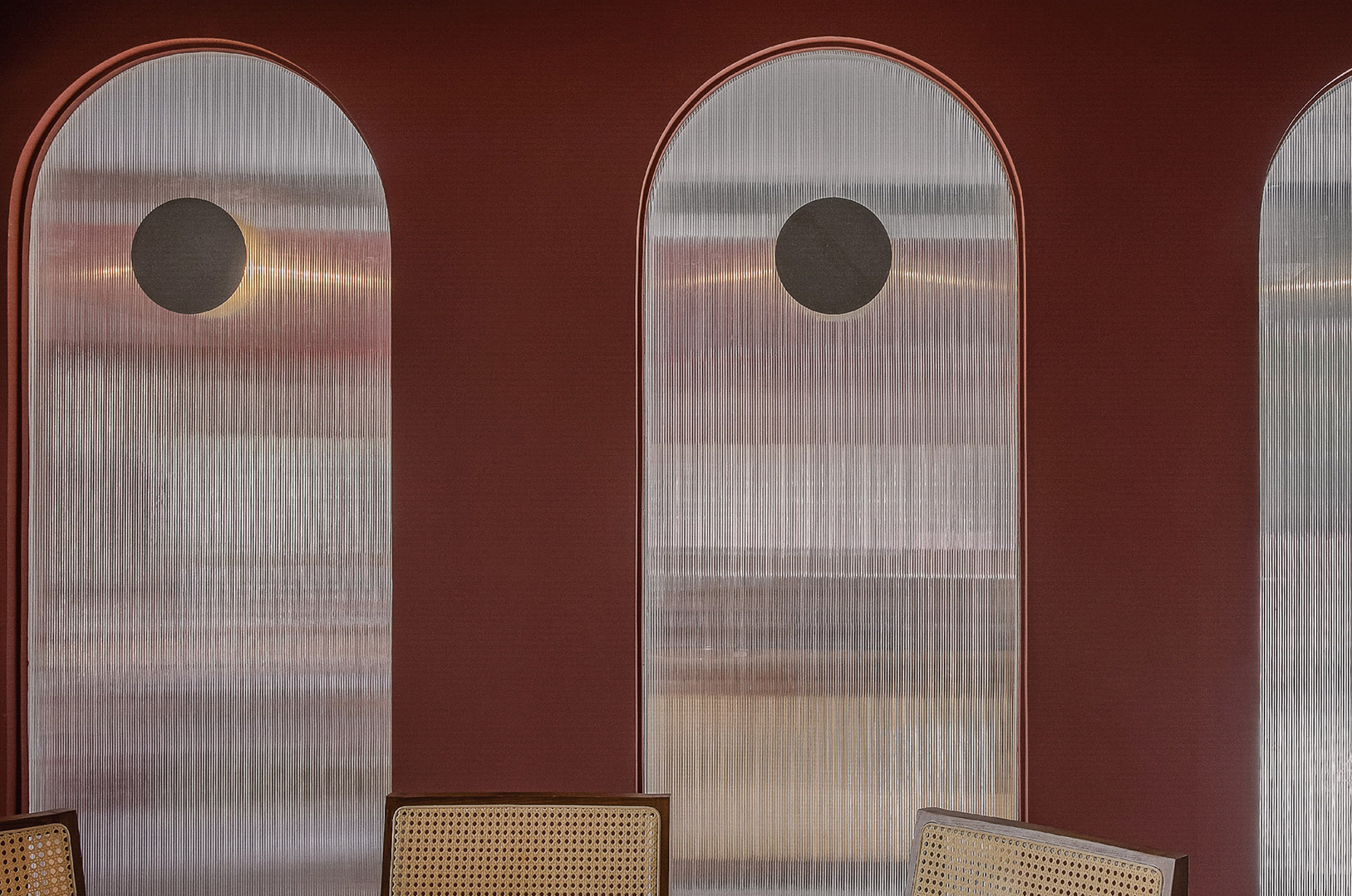
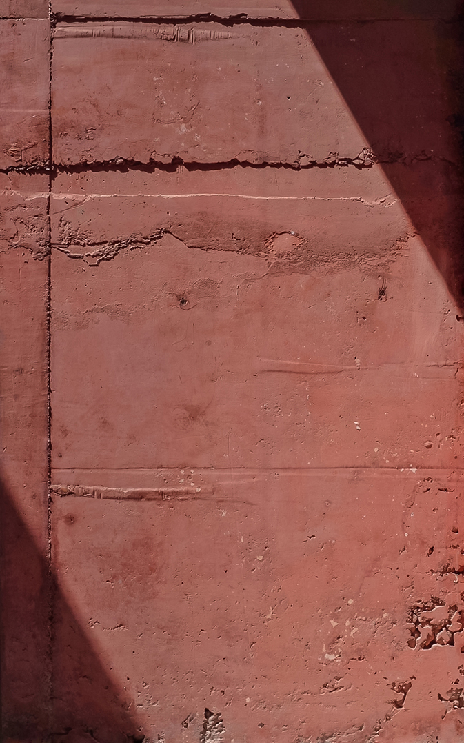
建筑主体的红色灵感来自沙漠的夯土,这种不同层次的红土色与蓝天的对比感很强,同时具有设计感和艺术性,门店的整个功能属性是由多元的休闲活动结合而成,选用这个颜色可以使得顾客在这里的感官体验更为舒适。建筑的主要材质采用彩色现浇混凝土,结合灰色系水磨石,复古玻璃砖和压纹玻璃做搭配。材质的选用既考虑到建筑的整体色调统一,具有相同的明暗表现,也从色相的角度把控了配色的对比度,在撞色的同时保证一致性。
水磨石的选用灰色基底并结合红色色相的小块色彩搭配使材质本身具有观赏性。也成为搭配空间基调的一部分。玻璃的透明属性在起到隔断作用的同时没有破坏整体空间的通透性,玻璃砖和压纹玻璃本身所具有的肌理也增添更加精致的细腻感。
The main building’s red color inspiration comes from the compacted soil of the desert. This red colour of different layers have a strong contrast with the blue sky. It also has more sense of design and artistry. The whole functionality of the store is attributed to a combination of multiple leisure activities. Choosing this colour can increase customers’ sense of comfort. The main material of the building is colored cast-in-place concrete, combined with grey terrazzo, large glass brick and embossed glass. Material selection not only takes into account the unification of the overall tone of the building, with the same light and shade performance, but also controls the matching of color contrast from the perspective of color phase. It ensures the overall consistency.
The choice of grey base and the combination of small pieces of red color make the material itself ornamental. It also becomes part of the tone of collocation space. The transparent glass does not destroy the permeability of the whole space while playing the role of partition. The texture of glass bricks and the embossed glass itself also adds a more delicate and refine feeling.
Contact
Add
C Area,321Cultural & Creative Park,
NO.666,Donghong Road,Chengdu City.


taobao